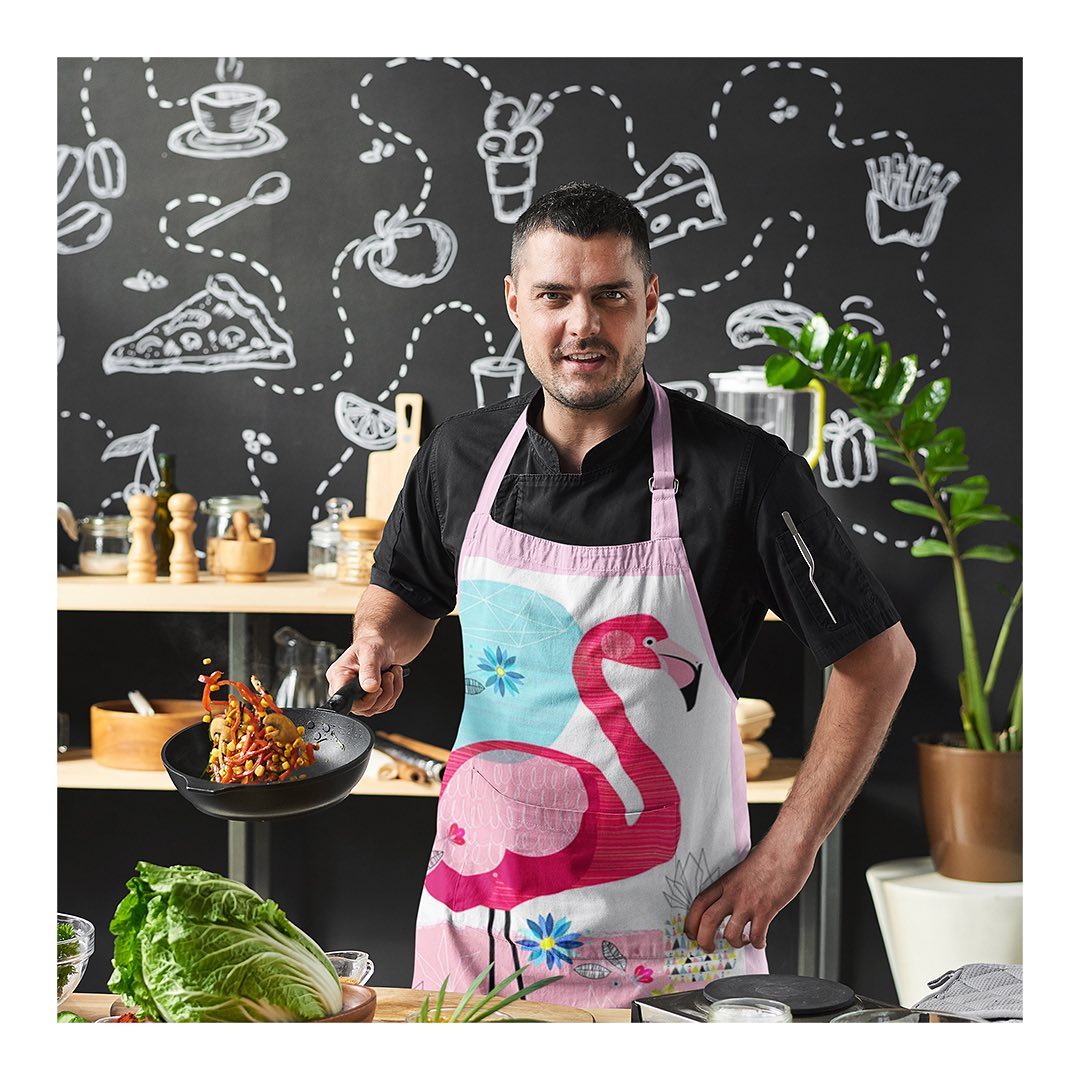
Run by an amazingly passionate Indian food connoisseur, Asa came to us with a simple thought: to create an identity that resonates with a variety of regional Indian food. Right from the glorious Awadhi cuisine to the spices of Kerala, Asa offered and delivered everything.
The Visual Approach
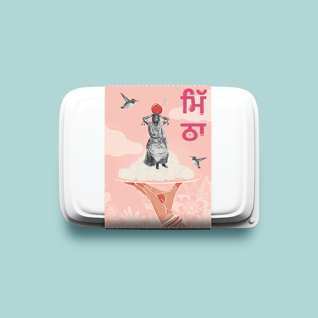
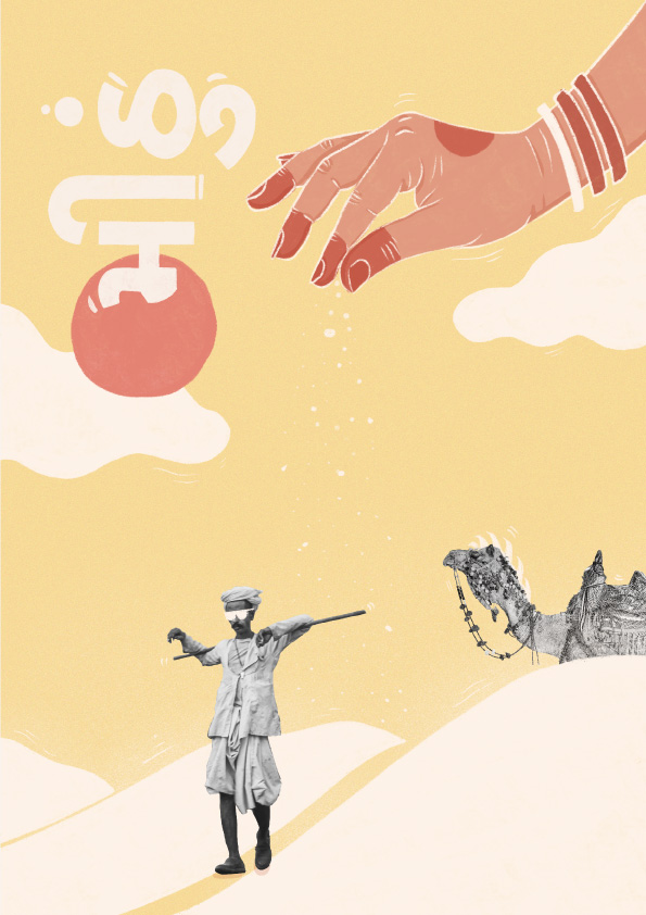
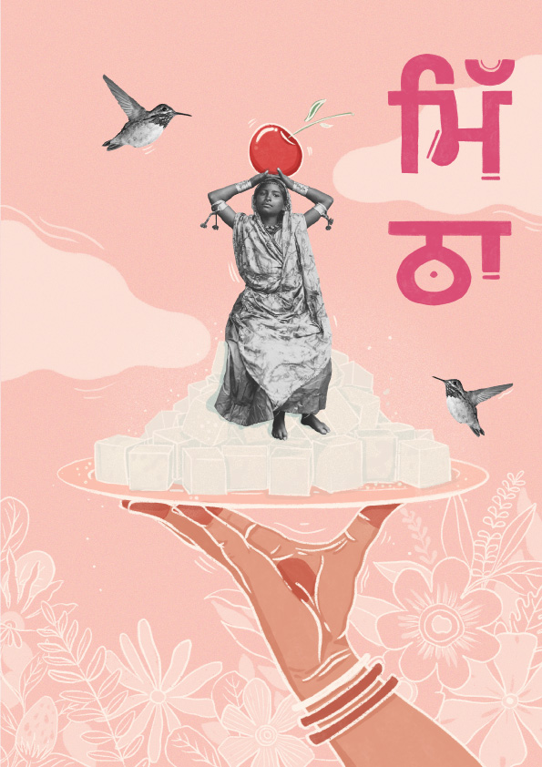
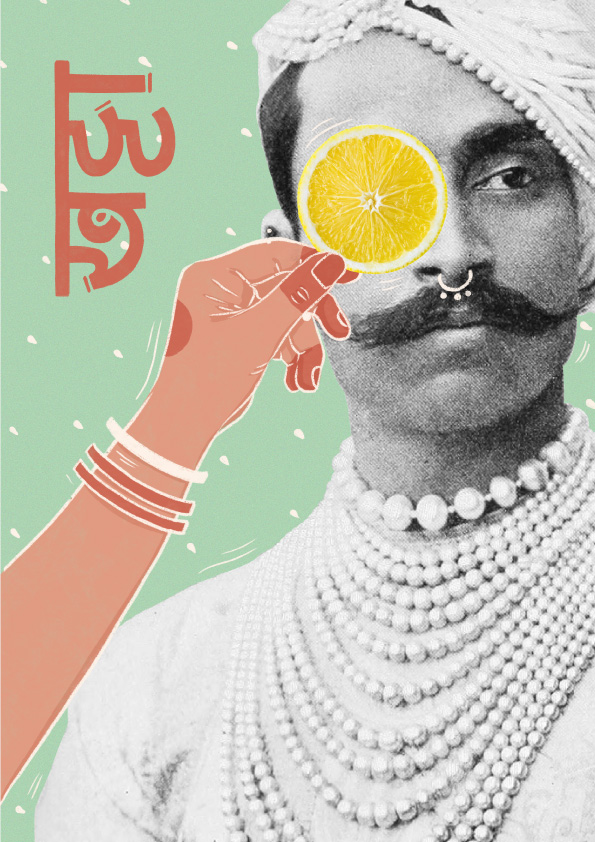
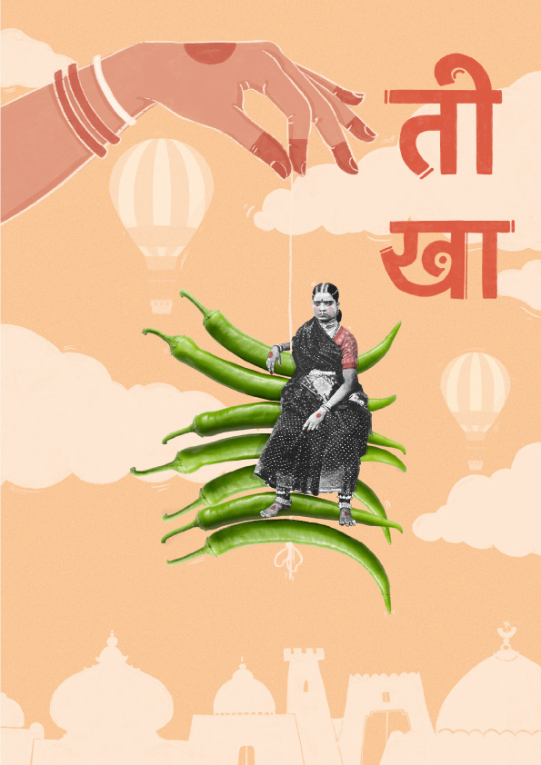
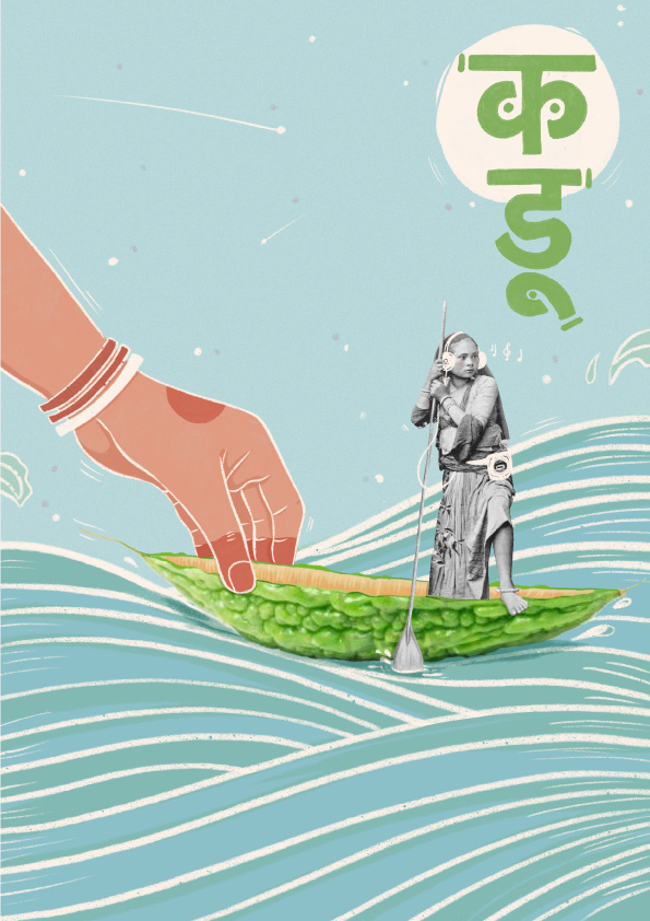
We presented multiple visual routes and treatments. Backed with thorough research, we suggested line drawings, illustrations, water coloured artworks and in the very end, with a slight bias in heart too - a mixed media approach. This was a direction explored by only a few restaurants and would help the brand bring forward a conventional and rather different visual language. And (to our surprise) the good folks at ASA believed in us to take the mixed media route - an unconventional step indeed! We soon began drafting out the manners in which every regional flavour can be showcased. And that's where the most difficult part came. We shifted our focus to the type of tastes instead and cracked an apt concept: Flavours Of Love.
The Translation
To be able to translate our thoughts into striking illustrations, we needed a talented artist on board who would explore the different alternatives and help us visualise what eventually could hold strong along with the identity. Priyadarshini Kacker (@p.kacker) brilliantly helped us execute this direction into 5 different artworks with her clarity of thought and willingness to experiment. Each representing a flavour, the visual communication adopted a mood that struck a chord with everyone. An identity that one never fails to acknowledge but rather treasure it for months to come.
The Execution
While the extended identity spoke a very vibrant, conventional, and quirky language we needed the central logo unit itself to be rather mature (in an effort to strike a balance between a serious yet light hearted brand).
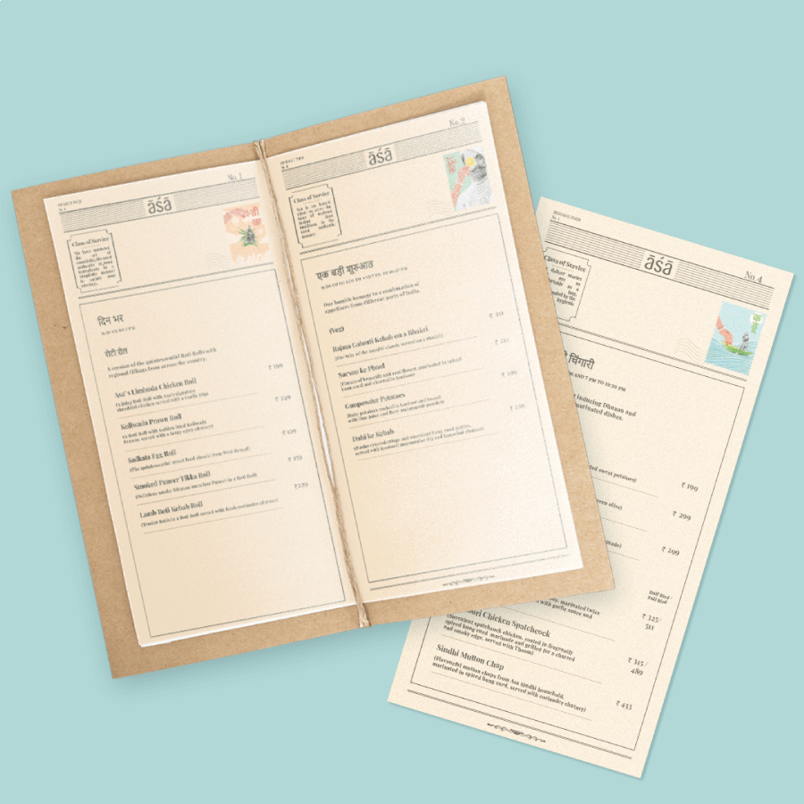
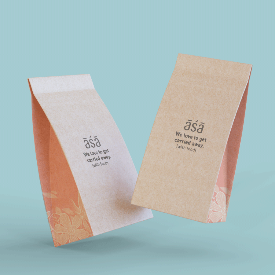
To put the whole story together, the artworks were then adapted for the sleeves of packaging. The entire delivery experience was enriched with excruciating minor details of converting the illustrations into stamps, sending out postcards, endearing notes, striking copy, curated Spotify playlists, using regional languages, and a telegram-like menu.
We love clients who trust us with our bold, endearing, and lesser known routes. We couldn't ask for anything better than a client like ASA!
Unlike other lifestyle spaces, Adani realty’s Belvedere Club is one of its kind. A premium club for the chosen few. A home to some of the most elite residents of the city it offers an unforgettable experience with its grade A amenities and offerings. The brief was to showcase the space for what it really was. To enlighten individuals of everything that awaited behind those doors. The luxury experience they had to offer for their members.
The Strategy
The idea behind this campaign was to focus on all kinds of activities that the club offered. A small family, a group or friends or even someone visiting alone- there was an experience awaiting them all. We believe that an experience of such sorts would only be justified if it was truly experienced by local influencers and encaptured into effective videos and stories. Stories of their day at the facility capturing every unique aspect of the club.
The Execution
mention names of influencers we got on board and how we created the engaging video- Sharing whole copy again for your reference.
The Brief
Unlike other lifestyle spaces, Adani realty’s Belvedere Club is one of a kind. A premium club for the chosen few. A home to some of the most elite residents of the city, it offers an unforgettable experience with its grade A amenities and offerings. The brief was to showcase the space for what it really was. To enlighten individuals of everything that awaited behind those doors. The luxury experience they had to offer for their members.
The Strategy
The idea behind this campaign was to focus on all kinds of activities that the club offered. A small family, a group or friends or even someone visiting alone- there was an experience awaiting them all. We believe that an experience of such sorts would only be justified if it was truly experienced by local influencers and encaptured into effective videos and stories. Stories of their day at the facility capturing every unique aspect of the club.
The Execution:
To execute this idea, we collaborated with 4 social media influencers who came from different backgrounds:
Heena Mehta - Heena Mehta is a blogger and we invited her to spend a day with her mom at The Belvedere Golf and Country Club. They explored the residency aspect of the club and enjoyed the various amenities the club had to offer.
Saloni Mehta & Shelat Datta: Saloni is a digital creator while Shelat is a lifestyle blogger. Both of them are good friends, and were invited to the club to show how you can spend the day chilling with your friends.
Harshika Patel: Harshika Patel is a fitness entrepreneur and we collaborated with her to show how fitness enthusiasts can indulge in various activities provided by the club like Yoga, Tennis, Golf etc.
All in all, through these collaborations, we were able to bring out the crux of the campaign, i.e., The Belvedere Golf and Country Club has something for everyone, across demographics and lifestyles.
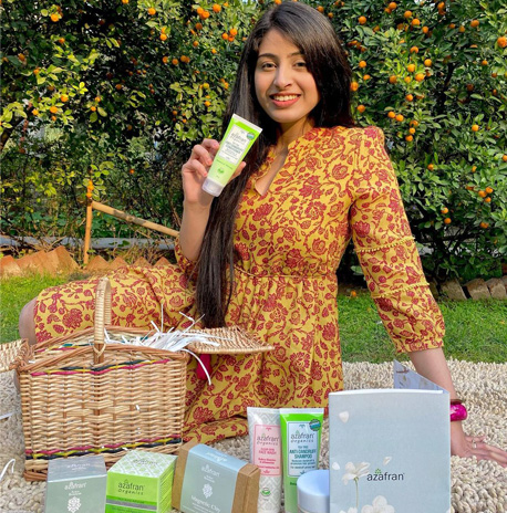
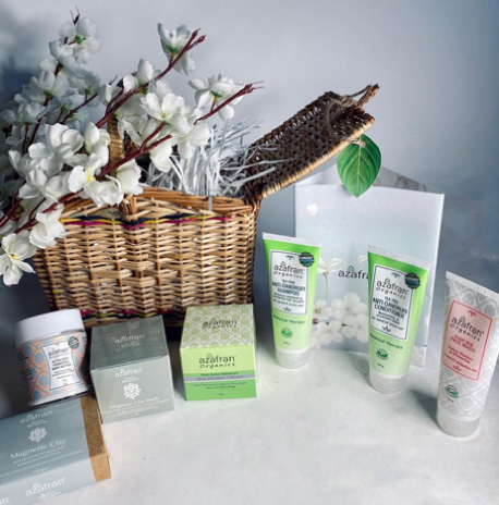
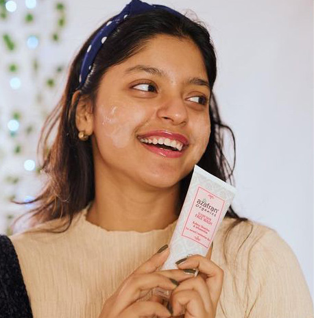
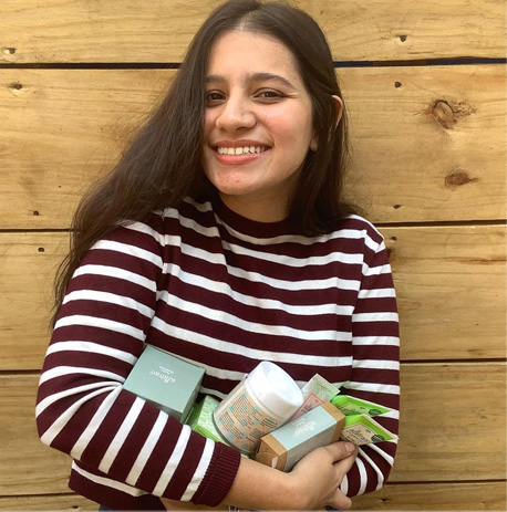
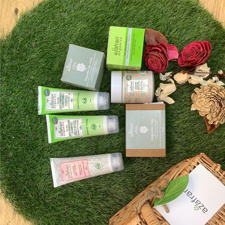
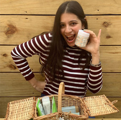
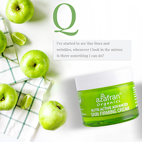
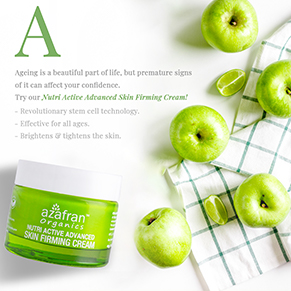
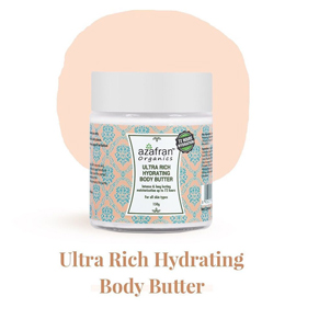
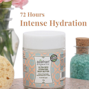
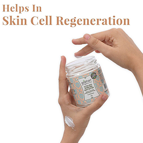
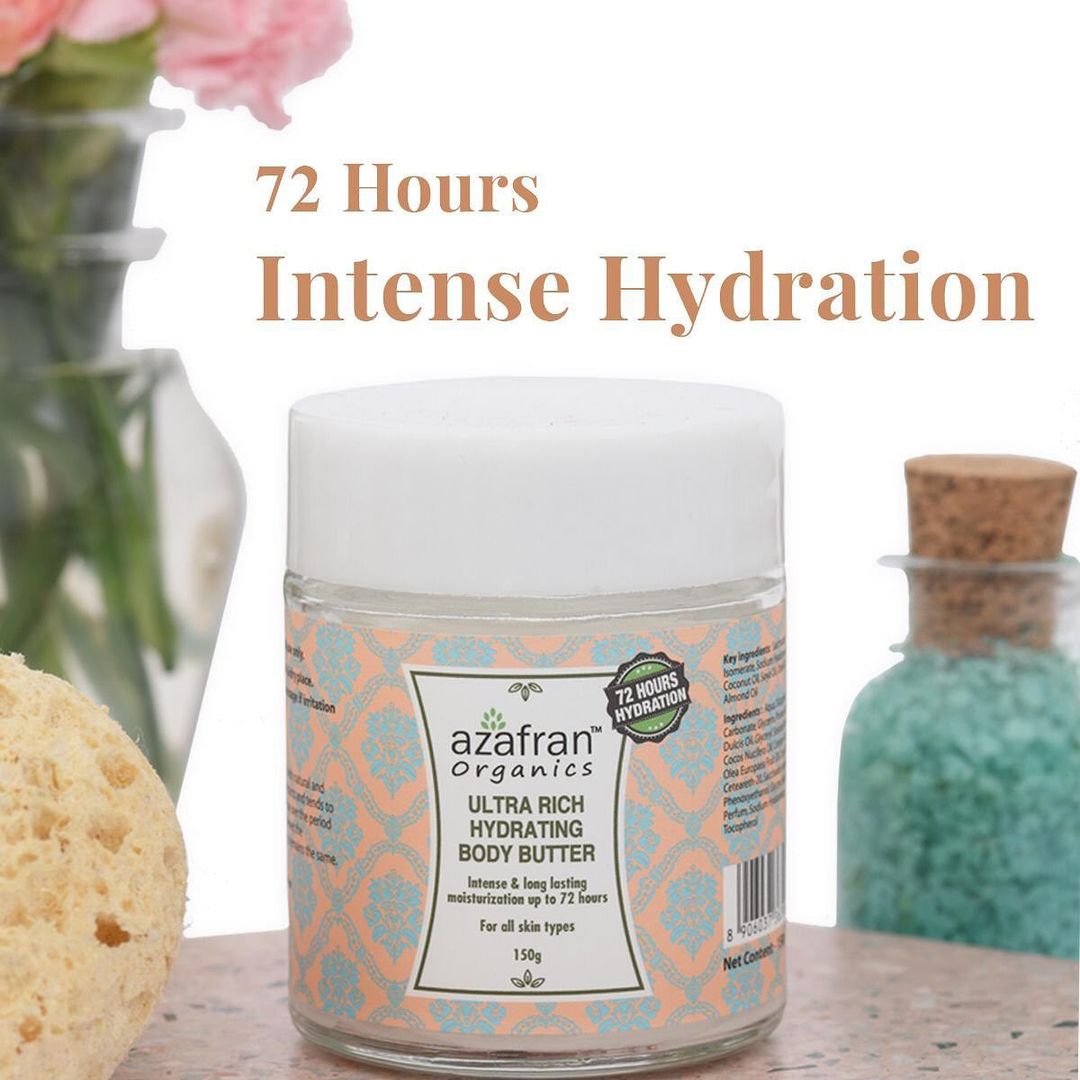
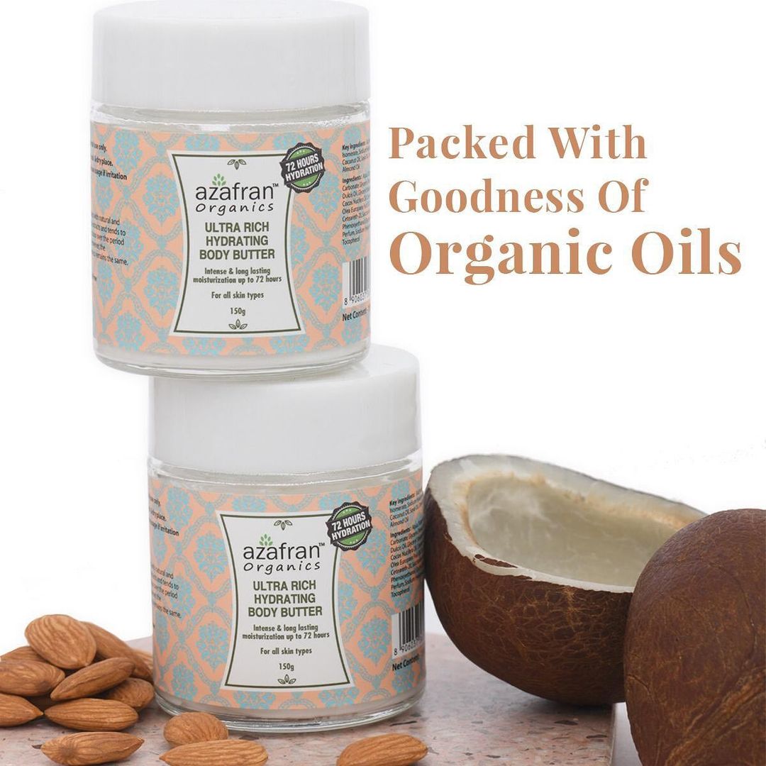
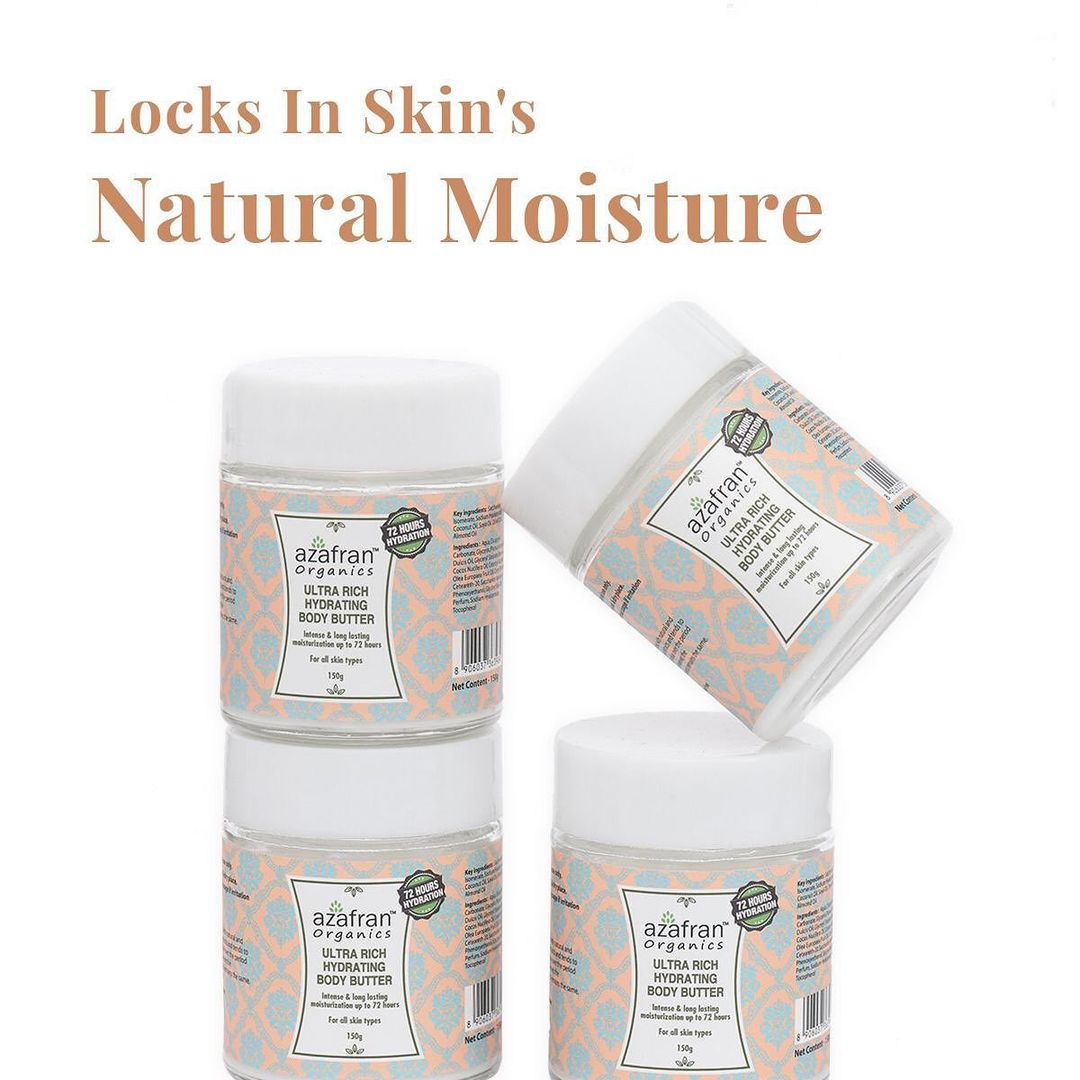
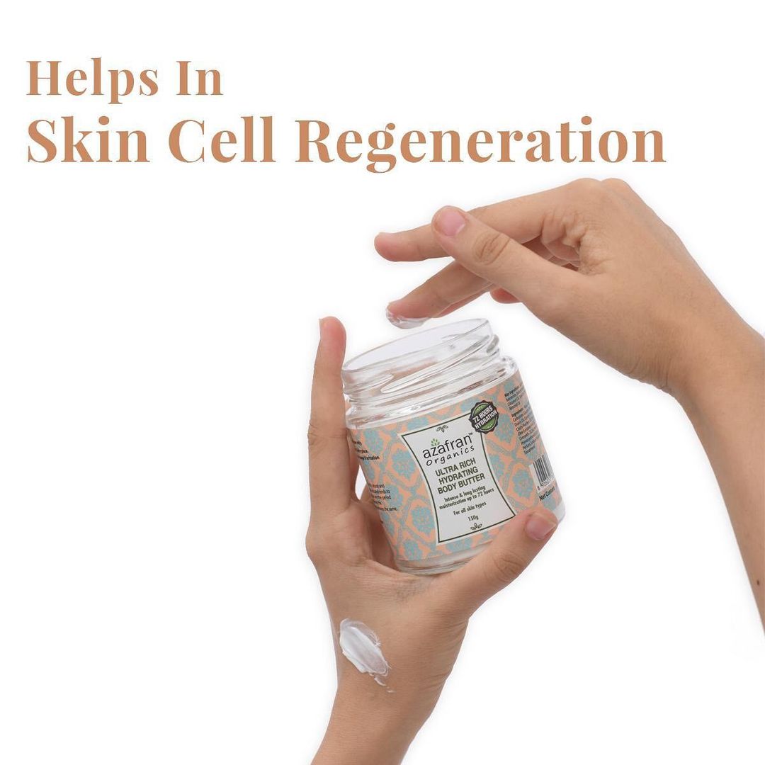
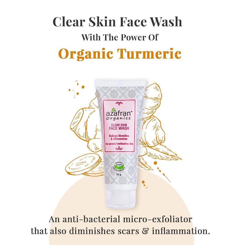
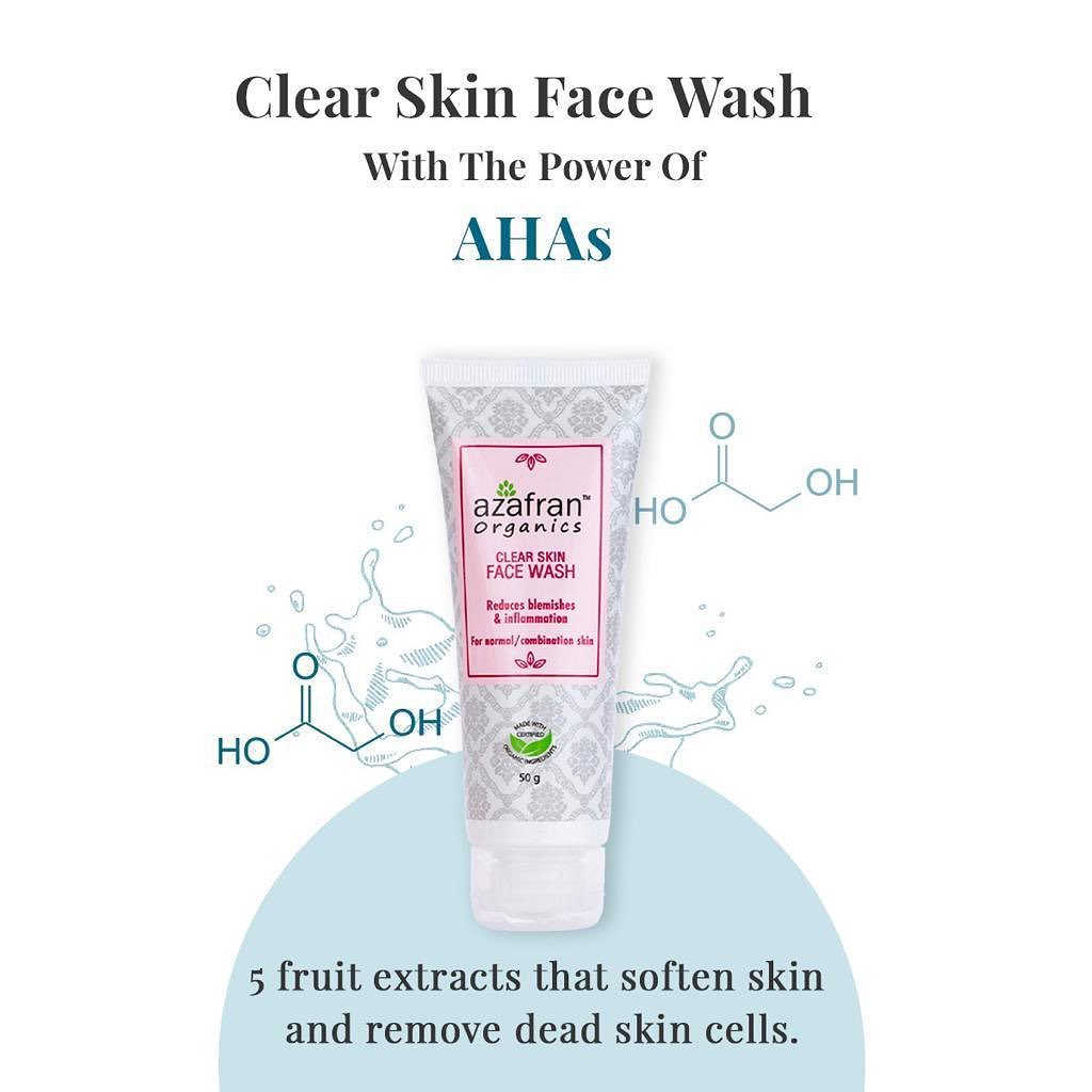
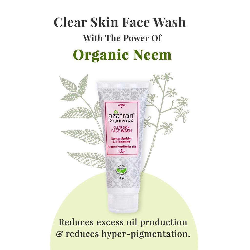
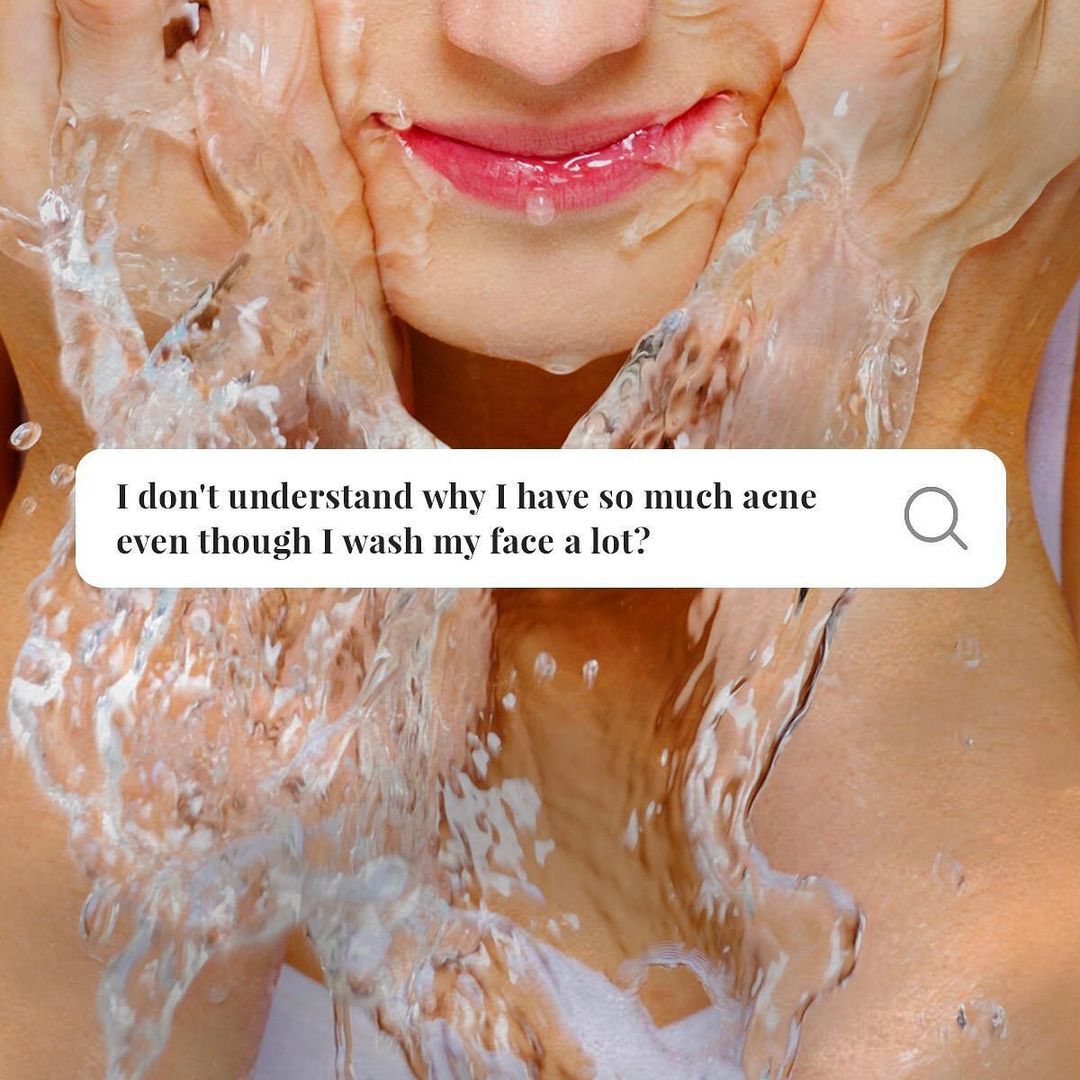
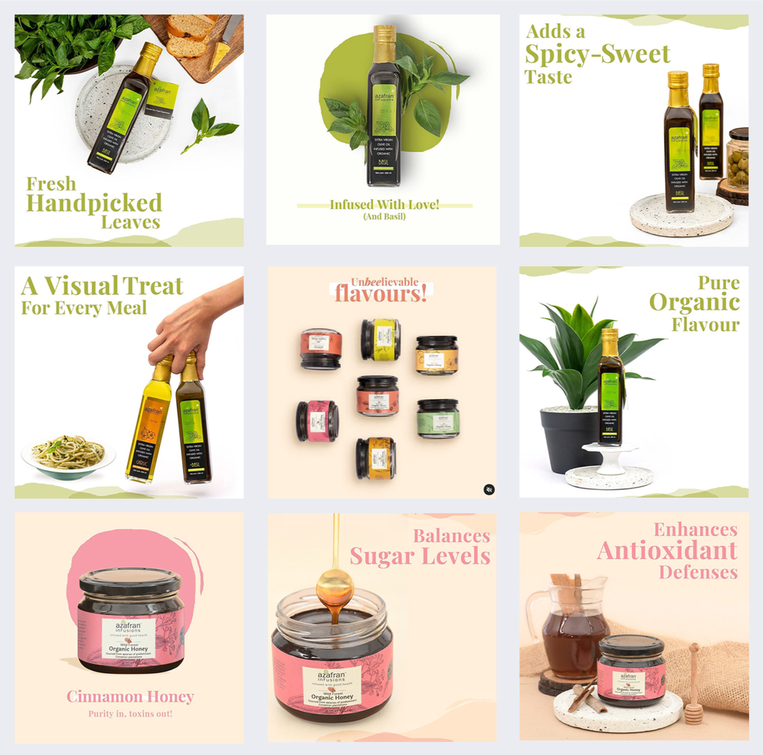
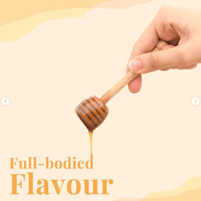
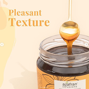
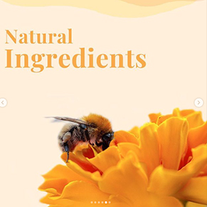
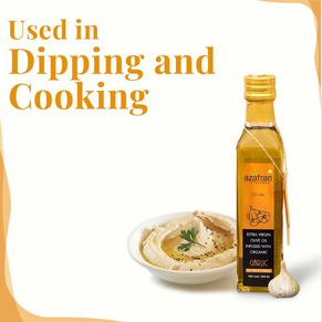
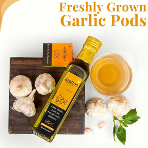
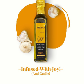
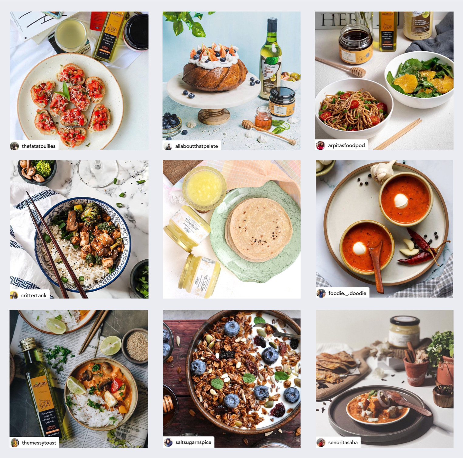
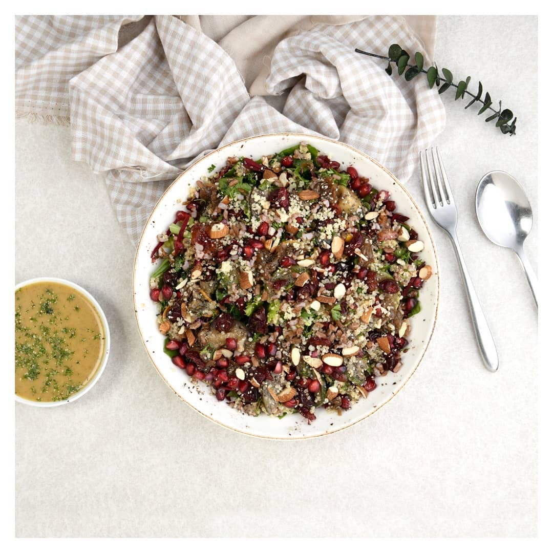
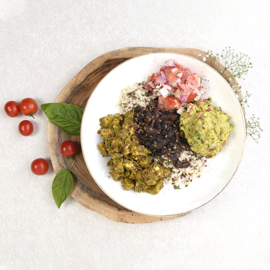
Azafran is a wellness natural brand with an extremely vast product line. As a relatively new company, we helped them start off by categorising and showcasing their products, its health benefits, what makes it better than what's out in the market and how the products can be applied. We used a combination of simple carousel formats, explanatory long set videos, GIF’s and more. Micro-Influencers were also roped in to develop recipes with the product helping us elaborate further on its application.
Agency: WeCliq
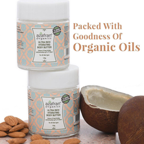
The Magic Of Organic
A 6-month campaign was planned to showcase the brand's various offerings and its benefits via influencer outreach. This campaign focussed on 3 primary categories: Food, Beauty, and Home. Divided into sets of two months, the campaign showcased all of the products and the health benefits by being 100% organic. We then reached out to our customers via a fun challenge to stir up their creativity and where they could win exciting prizes promoted by influencers of each respective category.
Campaign objectives
Build consistent visual language.
Increase brand awareness.
Build a loyal follower base.
Engage with the Azafran community.
Increase reach and engagement rate.
Increase social mentions via influencers.
Increase user generated content via contests.
Increase store footfalls and website visits via paid promotions.
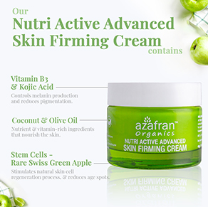
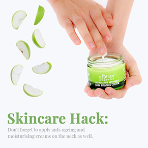
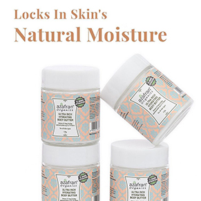
The idea was to visually showcase each and every product category and flavour via real imagery and fun GIFs. The products’ benefits were depicted in a carousel-like format, which helped us build an aesthetically appealing grid and maintain a consistent brand language. These products were also heavily promoted to reach the target audience.
We later introduced a challenge where influencers and recipe makers tag us in their stylised Azafran dishes, talk about the recipe on their social media, and offer exciting vouchers for their audience. All this was also done using the hashtag #TheMagicOfOrganic.
Azafran is a wellness natural brand with an extremely vast product line. As a relatively new company, we helped them start off by categorising and showcasing their products, its health benefits, what makes it better than what's out in the market and how the products can be applied. We used a combination of simple carousel formats, explanatory long set videos, GIF’s and more. Micro-Influencers were also roped in to develop recipes with the product helping us elaborate further on its application.
Agency: WeCliq
The Magic Of Organic
A 6-month campaign was planned to showcase the brand's various offerings and its benefits via influencer outreach. This campaign focussed on 3 primary categories: Food, Beauty, and Home. Divided into sets of two months, the campaign showcased all of the products and the health benefits by being 100% organic. We then reached out to our customers via a fun challenge to stir up their creativity and where they could win exciting prizes promoted by influencers of each respective category.
Campaign objectives
Build consistent visual language.
Increase brand awareness.
Build a loyal follower base.
Engage with the Azafran community.
Increase reach and engagement rate.
Increase social mentions via influencers.
Increase user generated content via contests.
Increase store footfalls and website visits via paid promotions.
The idea was to visually showcase each and every product category and flavour via real imagery and fun GIFs. The products’ benefits were depicted in a carousel-like format, which helped us build an aesthetically appealing grid and maintain a consistent brand language. These products were also heavily promoted to reach the target audience.
We later introduced a challenge where influencers and recipe makers tag us in their stylised Azafran dishes, talk about the recipe on their social media, and offer exciting vouchers for their audience. All this was also done using the hashtag #TheMagicOfOrganic.
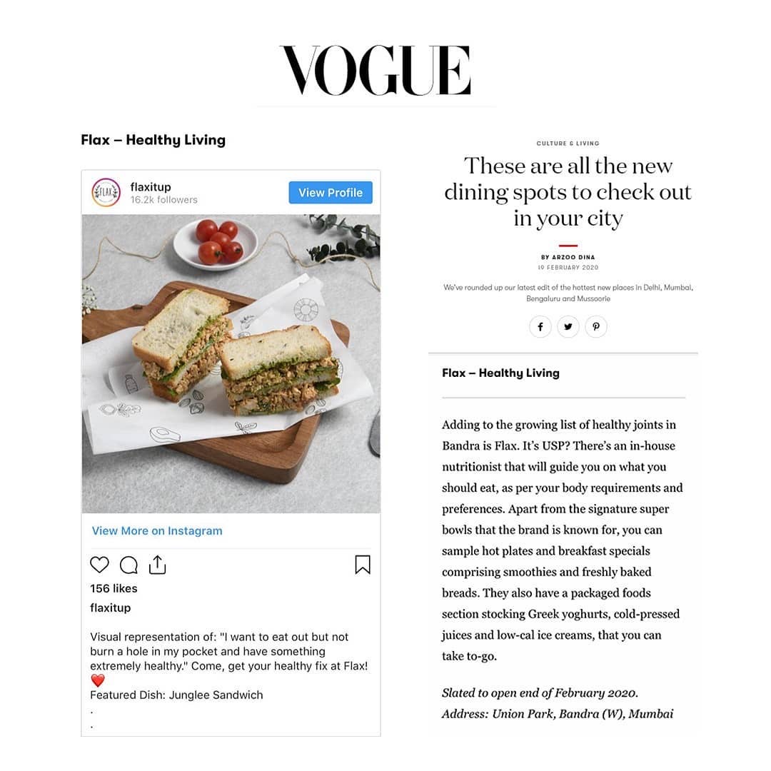
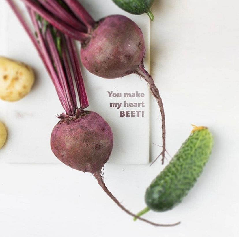
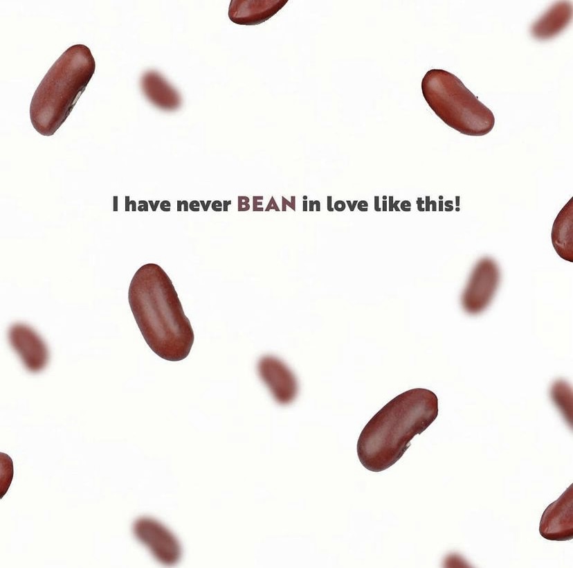
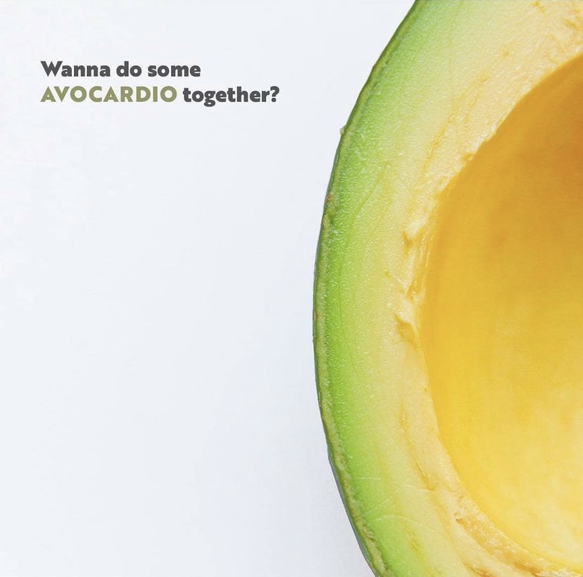
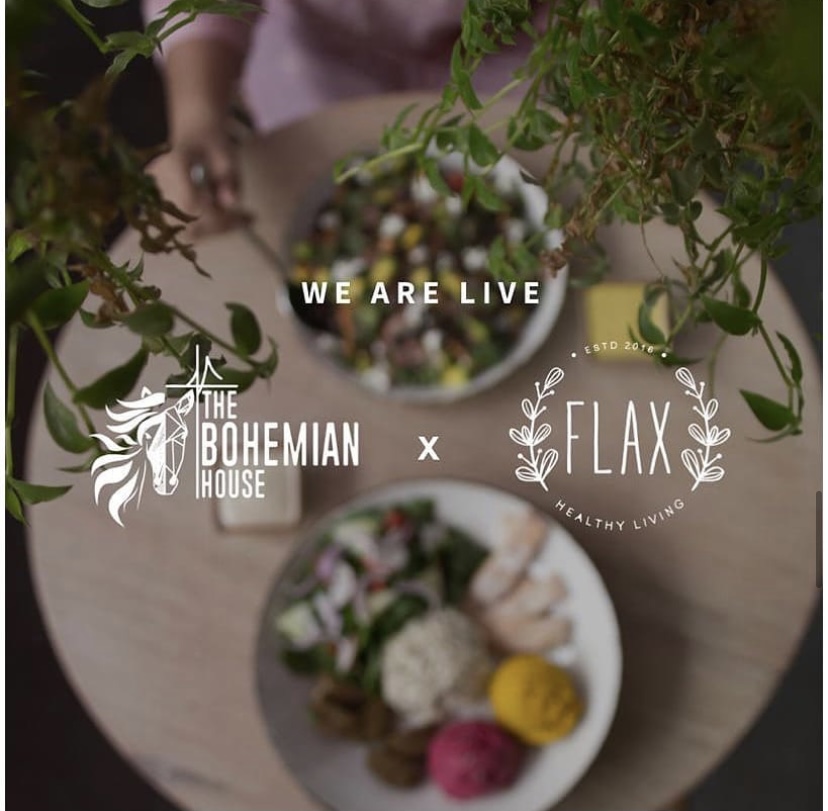
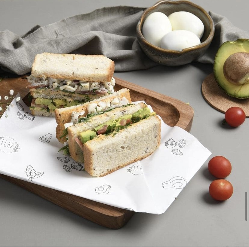
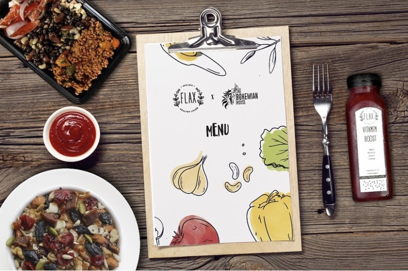
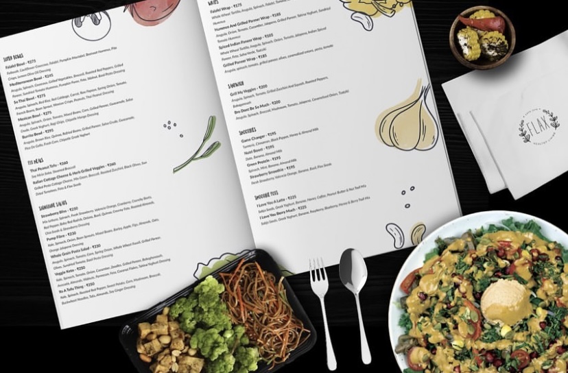
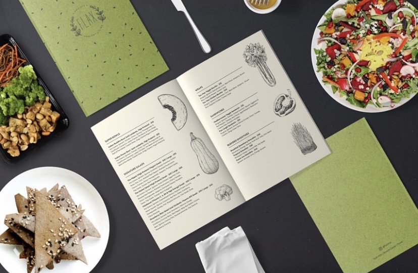
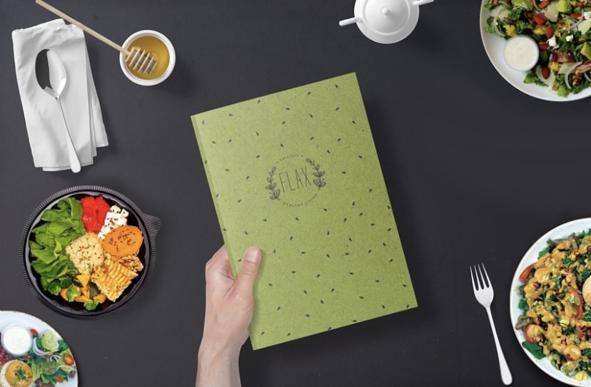
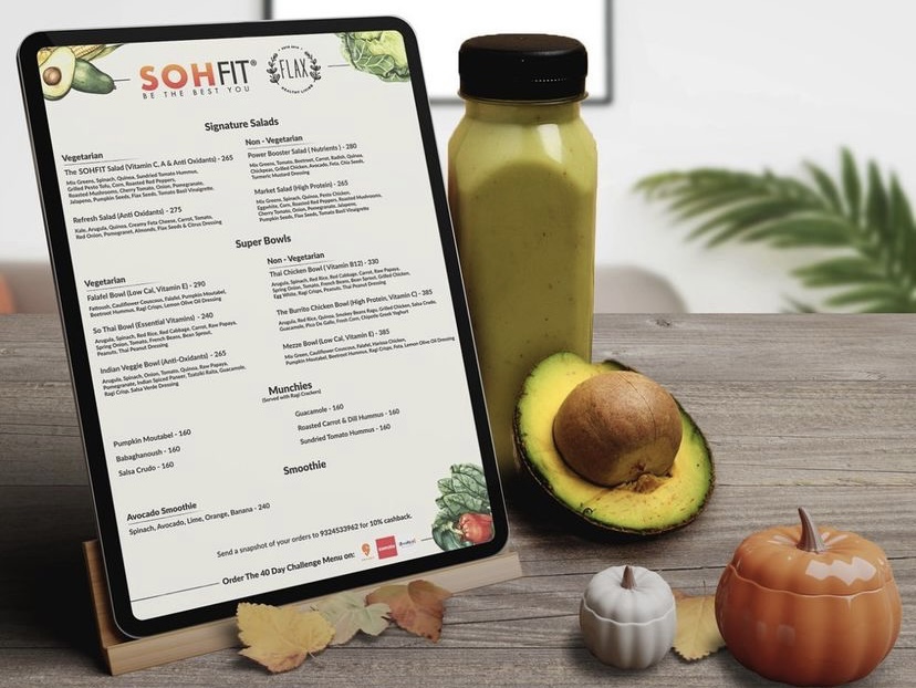
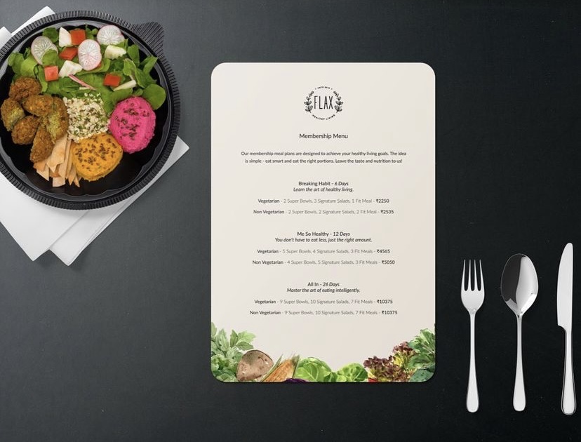
Flax foods was our first step into the Mumbai Office. We made a debut by building out a visual guideline for them while also helping them work on the digital content they created for their social platforms.
The photoshoot was designed to keep things minimal and product focused. The identity and the visual direction the brand decided to take was however designed by an in-house experience-lead designer. From the kind of stories that went out to the way in which type was paired together- the design experience was custom made with a brand guideline.
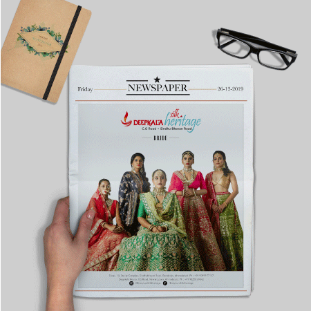
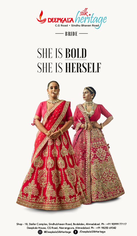
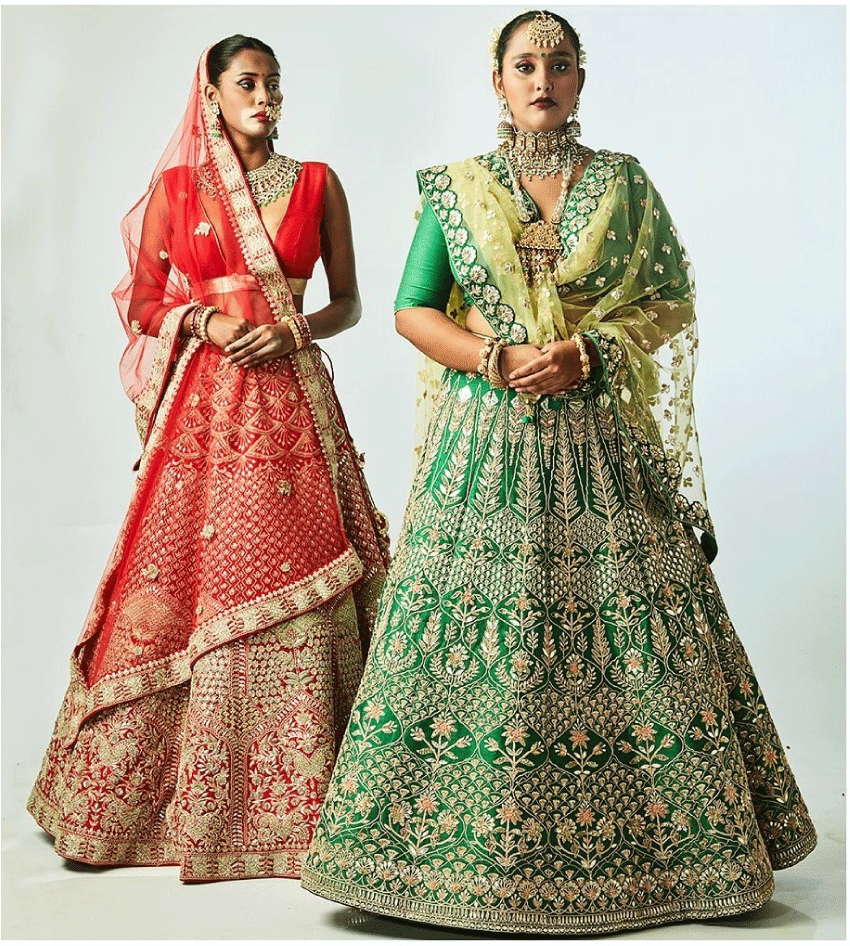
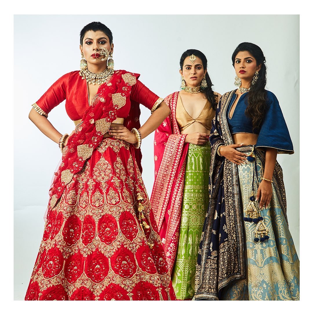
Deepkala Silk Heritage is a 70 year old ethic store based in Ahmedabad. They showcased affordable to mid-premium Indian casuals, bridal and festive wear. For the past 20 years they were based on CG road after which they moved to a premium shopping hub Sindhubhavan road. This was their first ever bridal season with the new store and brand new collection we knew could give tough competition to others in their field.
THE PROBLEM
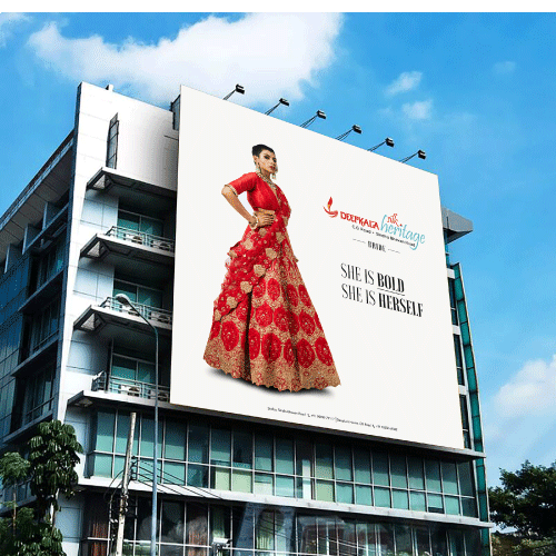
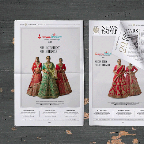
It was a time when numerous brands from across the city had already put out their bridal campaigns. These campaigns were on hoardings, in newspapers and on all their respective social platforms swell. Most had a celebratory vibe, a bride surrounded with flowers of family members or friends- the messaging too was looking quite similar across the board. The need of the hour was a unique thought, a fresh approach.
THE STRATEGY
It was another day at the store. Our team was there to discuss possible ideas and thoughts. While we sat outside waiting for the meeting to begin we noticed the kind of brides that we’re coming to the store. The diversity was marvellous.Each unique, confident and willing to experiment. There was something so real about the way in which they chose garments and adorned them on while trying them. It was then that the idea came to us- the idea to empower the girl who was soon to become the bride. We decided to showcase our garments in extremely minimal backdrops-plain whites so that the women and the garments took centre stage. The concept was “Her Own Kind Of Beautiful…”
We used plus size models, darker skin models, lean ones, ones with a code and many more. We tried to cover as much diversity as we could, owing it to the kind of beautiful women who actually visited the store for their bridal garments, pulling them off with utmost confidence and panache.
The campaign was introduced with a bang and caught the eye of several publications while also proving to be empowering and relatable to many young women looking for their bridal ensemble. It was truly a unique content that cut through the clutter and once again gained several social mentions and acknowledgements for the brand.
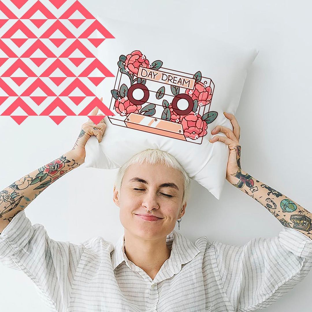
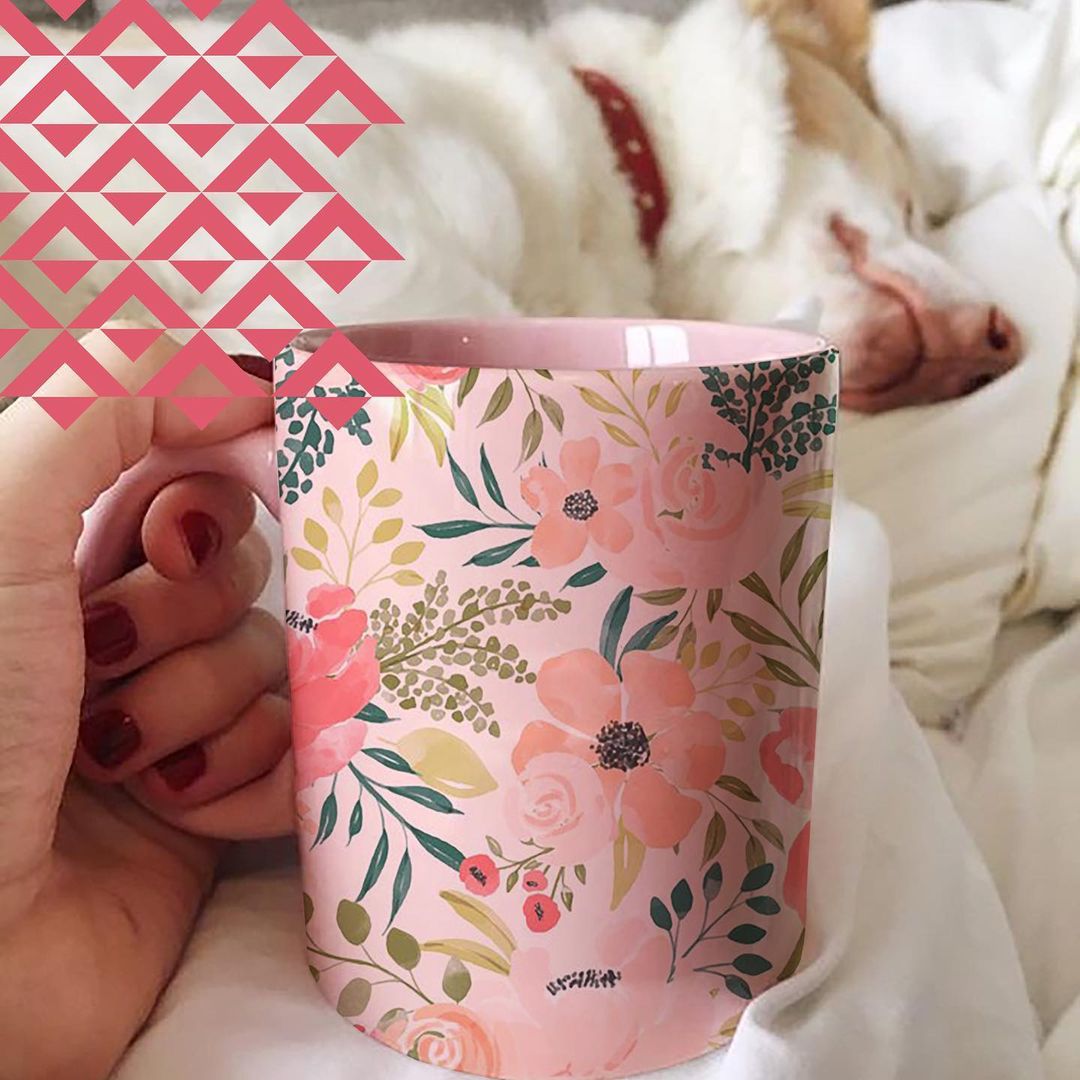
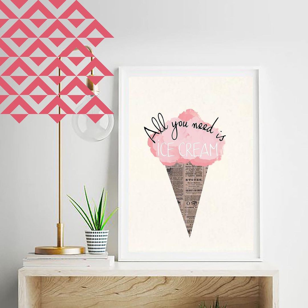
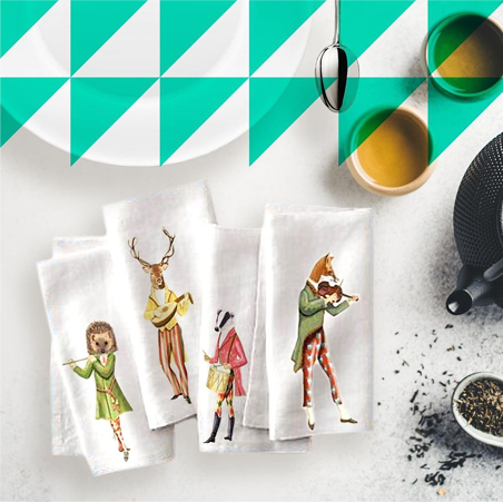
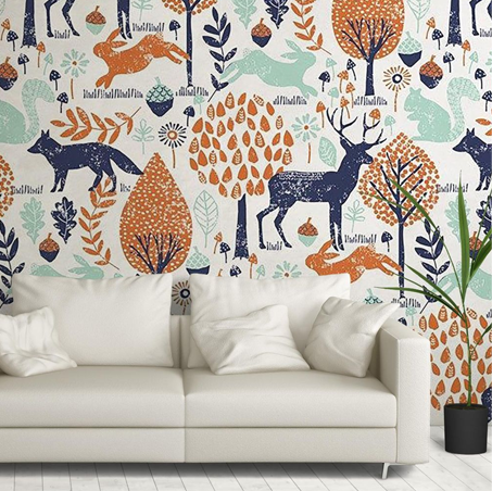
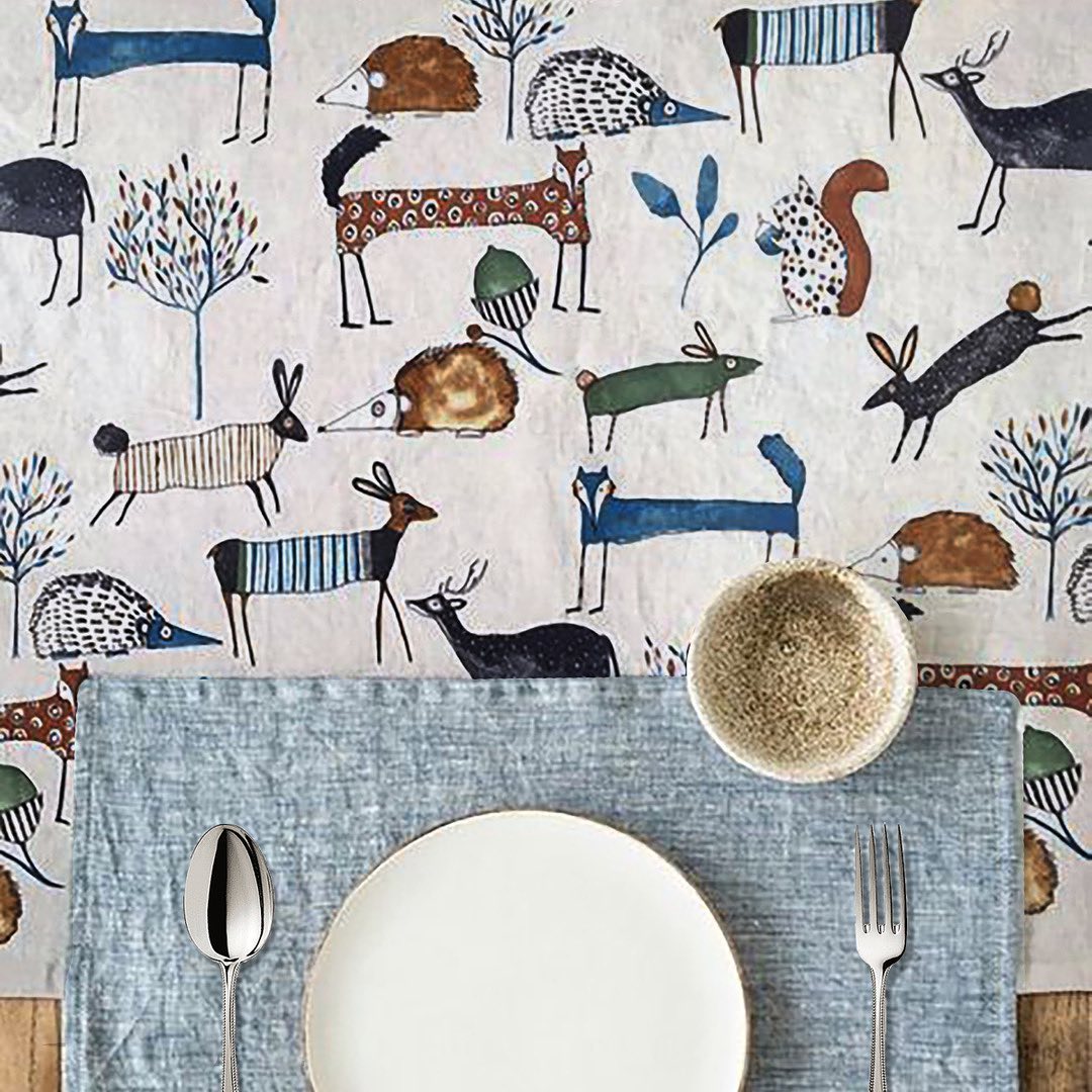
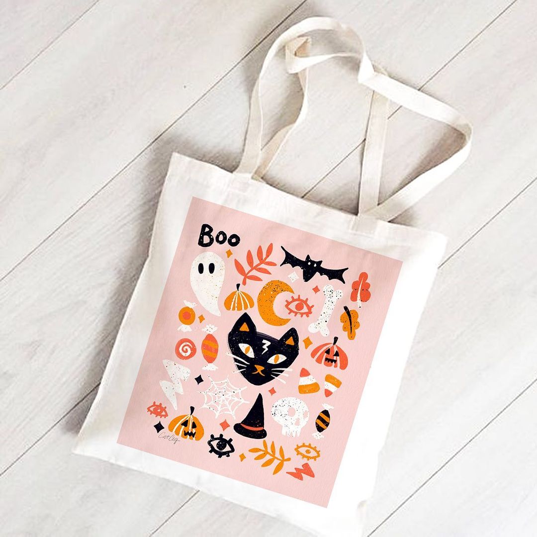
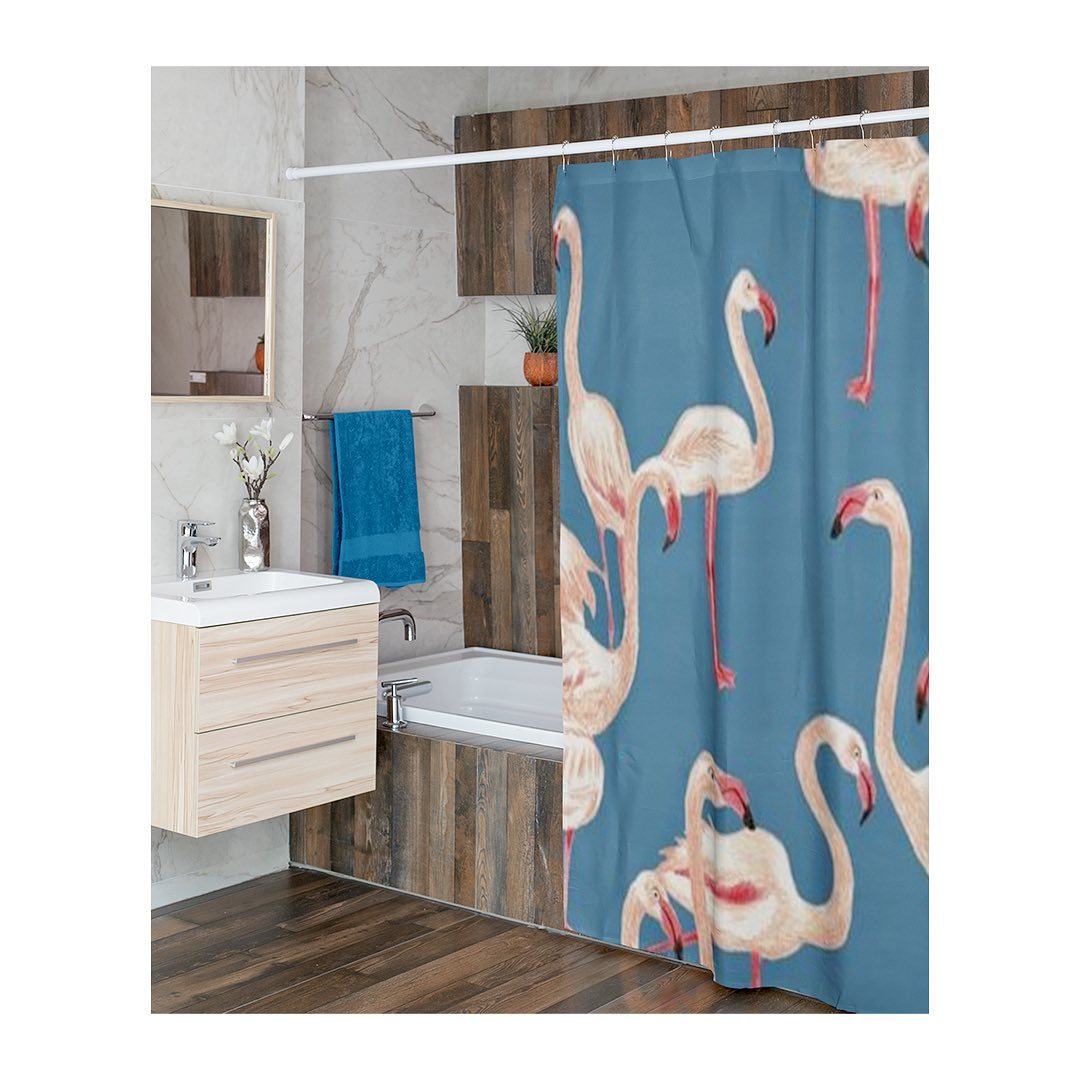
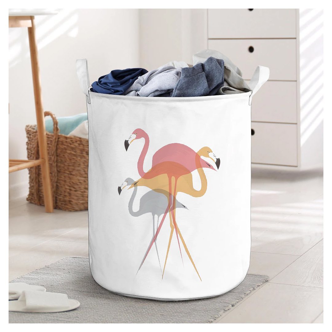
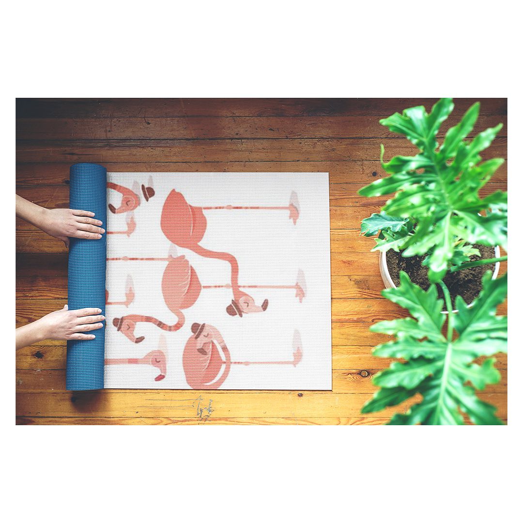
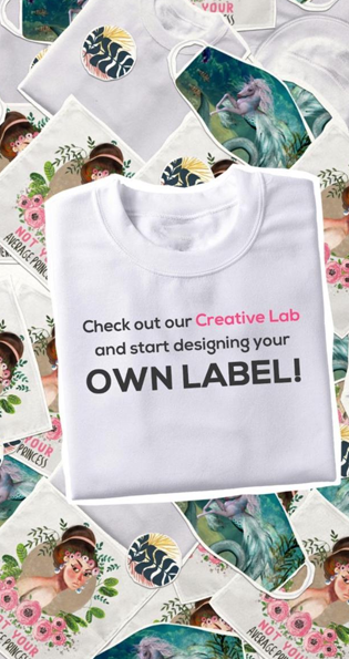
Design an endless range of products from home decor, apparel, stationery & more. Upload your art, or create something from scratch & pair them with irresistible fabrics!
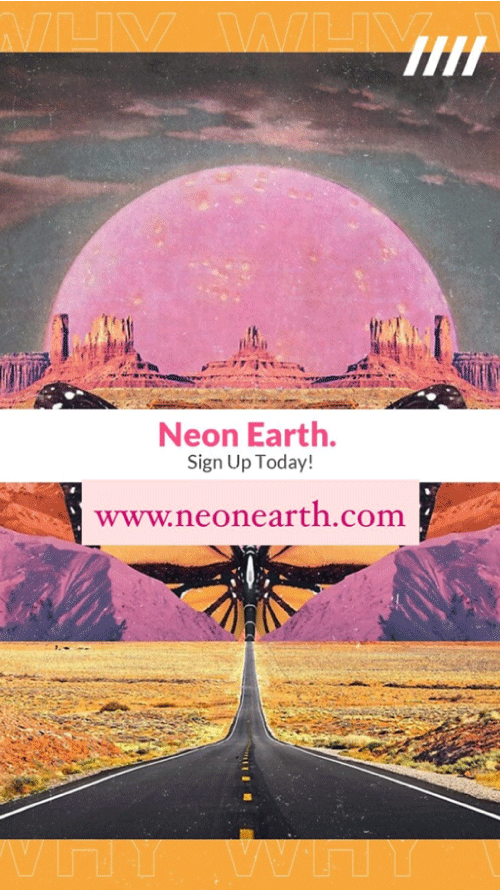
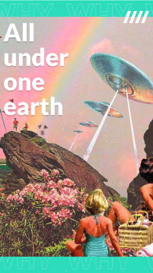
Neon Earth was a very exciting project for the team because we had a shared interest- digital artworks. With deep rooted brand values, they came to us with a simple brief, to amplify their portfolio to potential customers in the United States.
The Execution
Pre launch, our goal was to onboard as many illustrators from across the world as possible. Back with smart strategy, we started off with something called a colour wheel. We showcased prints on different products, shared informative content ideal for illustrators, highlighted benefits for illustrators to subscribe with us, shared relatable design humor, and more. For each day of the week we had a designated content bucket and colour scheme. The colour scheme, artworks and showcases would change week after week. It’s always important to attach a face with a brand as human as Neon Earth. To solve that problem, we brought the team at Neon Earth on the forefront and hosted various IGTV sessions to talk about the brand ethos. And to add to that, we also had a fun round of questions with some upcoming artists to build excitement and fun. The aesthetics and visual communications were all backed with a very strategic thought process that helped us grow quickly amongst the design fraternity.
motion Logo
The Launch
Next came the big launch of their online portal for customizable products with designs and illustrations to choose from across the globe. To make a strong start we began with a lineup of relatable situations and facts. We went back to some of the most trusted designer surveys for the US market and borrowed the stats that best represented our artists’ problems and recommendations. On the day of the launch we put out a powerful animated video for the audience to truly understand the brand and everything it stands for.
The Challenges
To keep potential customers and designers engaged is a tricky balance to maintain. That's when we realised that channel specific content was the best route ahead. While we continued to use facebook as a platform to showcase products and draw more customers, Instagram was used to keep the creative fuels churning for illustrators.
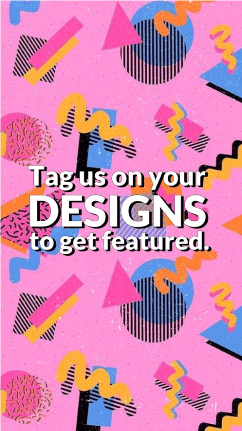
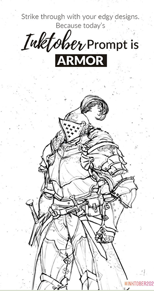
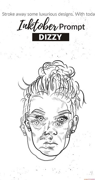
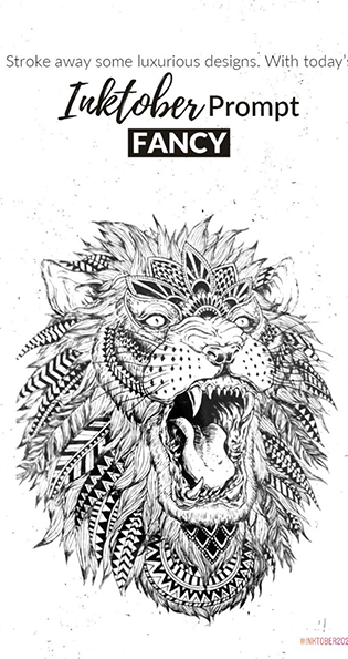
Each month brought with it exciting design challenges with rewards. We covered several themes like Oktoberfest, Halloween, Inktober Challenge, and more.
The Stories
Social media is known for its robust possibilities and we wanted a brand like Neon earth to make the most of a holistic strategy. To support the already bustling feed we did a series of stories and highlights to keep audiences engaged. From something as simple as what the brand was about to things the brands loved, we had a set of highlights and stories that kept the audience gripped.
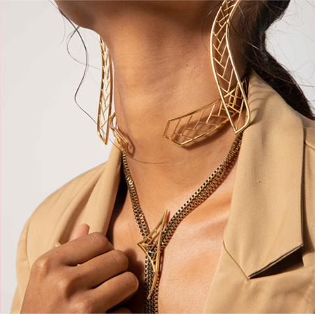
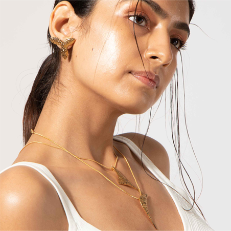
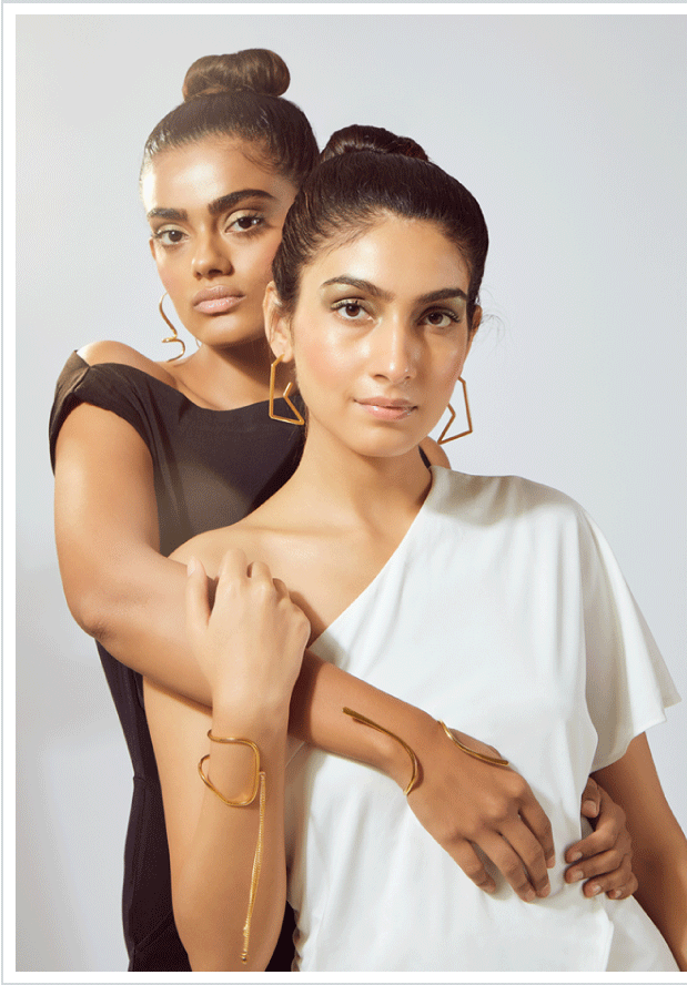
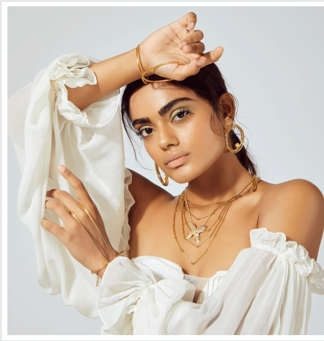
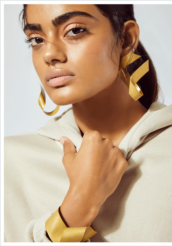
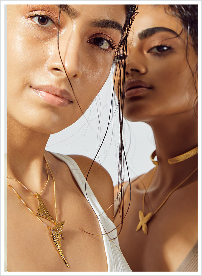
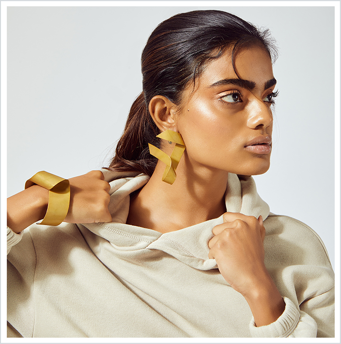
A fast fashion jewellery brand times a young talented celebrity stylist - we thought it was a match made in heaven! This collaboration was based on the idea that people were looking for adorable, yet unconventional kinds of jewellery while they Zoomed away their hearts from home during the pandemic. Just before the festive season, the collaboration was published on the duo’s social media platforms with a strong campaign idea.
The collection highlights the contrast between two jewellery pieces but also invites comparisons. The elements such as dark and light skin tones, subjects in motion and in rest, striking backgrounds and monotone makeup create meaning that is not found in the dialogue. These elements have been accompanied by jewellery that varies in forms and shapes.
That's what juxtaposition stands for: inspired by the ancient arts and literature, it enables an artist to create striking opposites yet leave space for both to function in sync. We've always championed change and the ability to step out of traditions and create a trend. This shoot aimed to achieve exactly that - challenge the typical perspective and step out of the norms.
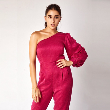
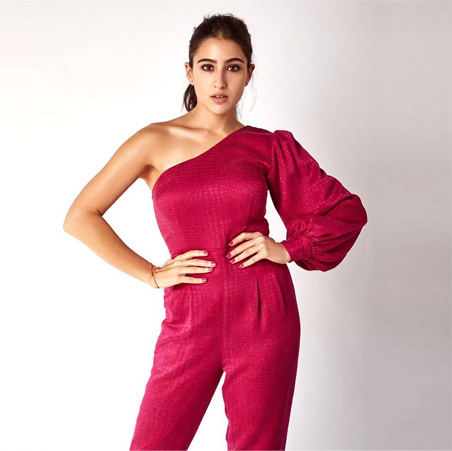
The campaign was later supported by a round of celebrity gifting which brought forward substantial growth in visibility and credibility for the brand. Some of the pieces were also used in styling projects for actresses like Sarah Ali Khan and more.
From a purely branding perspective, the campaign helped put the brand on the map. The association brought forward recognition and connections for several other lucrative opportunities