Branding & Packaging
THE TEAM
Agency: WeCliq
THE BRIEF
Run by an amazingly passionate Indian food connoisseur, Asa came to us with a simple thought: to create an identity that resonates with a variety of regional Indian food. Right from the glorious Awadhi cuisine to the spices of Kerala, Asa offered and delivered everything.
The Visual Approach
We presented multiple visual routes and treatments. Backed with thorough research, we suggested line drawings, illustrations, water coloured artworks and in the very end, with a slight bias in heart too - a mixed media approach. This was a direction explored by only a few restaurants and would help the brand bring forward a conventional and rather different visual language. And (to our surprise) the good folks at ASA believed in us to take the mixed media route - an unconventional step indeed! We soon began drafting out the manners in which every regional flavour can be showcased. And that's where the most difficult part came. We shifted our focus to the type of tastes instead and cracked an apt concept: Flavours Of Love.

The Translation
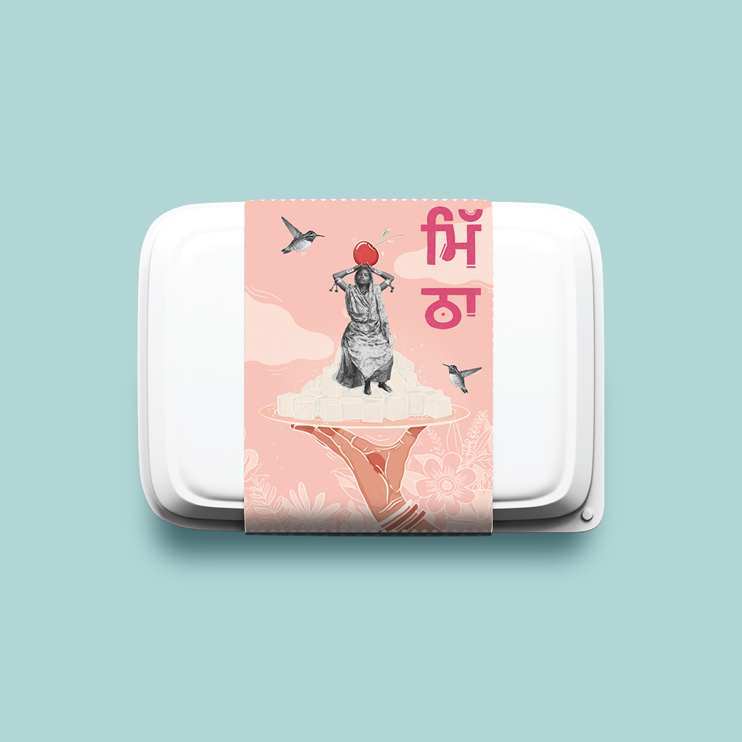
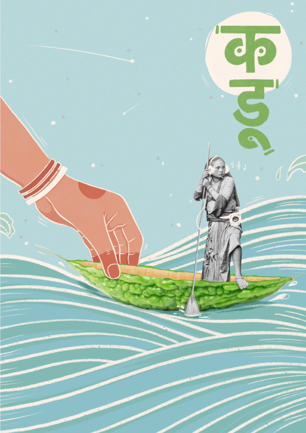
To be able to translate our thoughts into striking illustrations, we needed a talented artist on board who would explore the different alternatives and help us visualise what eventually could hold strong along with the identity. Priyadarshini Kacker (@p.kacker) brilliantly helped us execute this direction into 5 different artworks with her clarity of thought and willingness to experiment. Each representing a flavour, the visual communication adopted a mood that struck a chord with everyone. An identity that one never fails to acknowledge but rather treasure it for months to come.
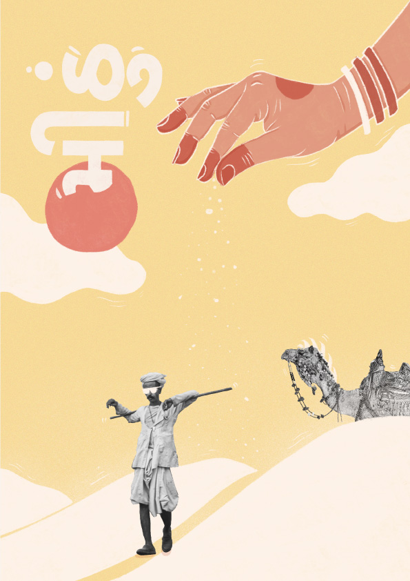
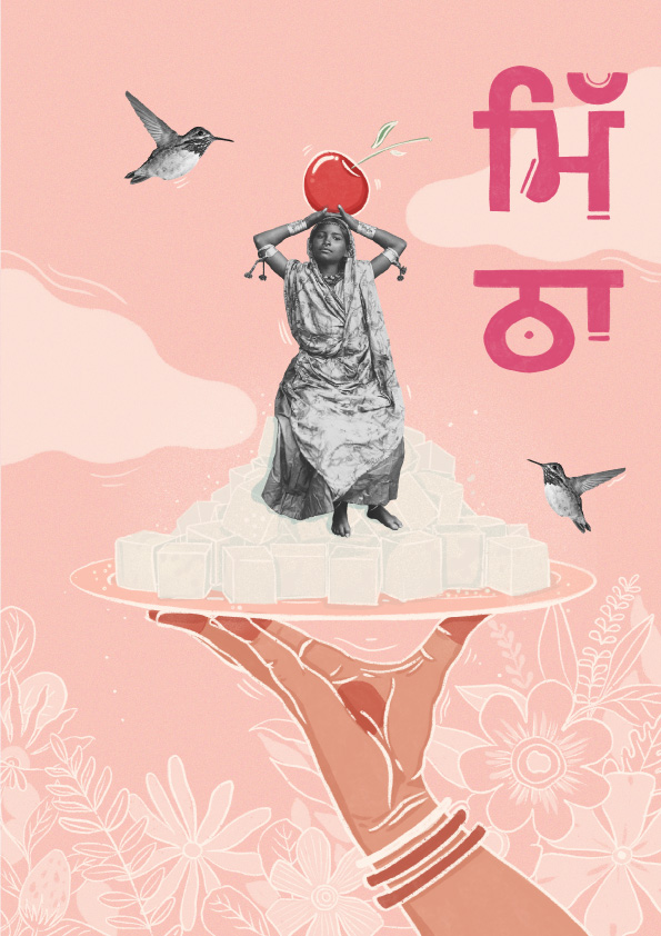
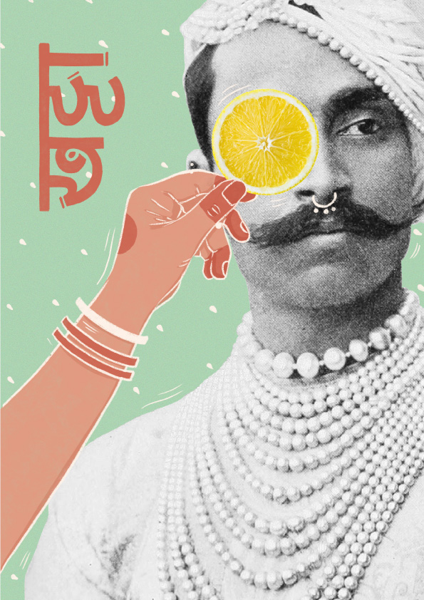
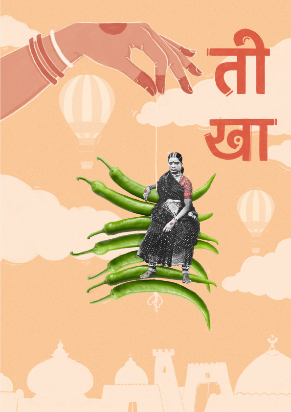
The Execution
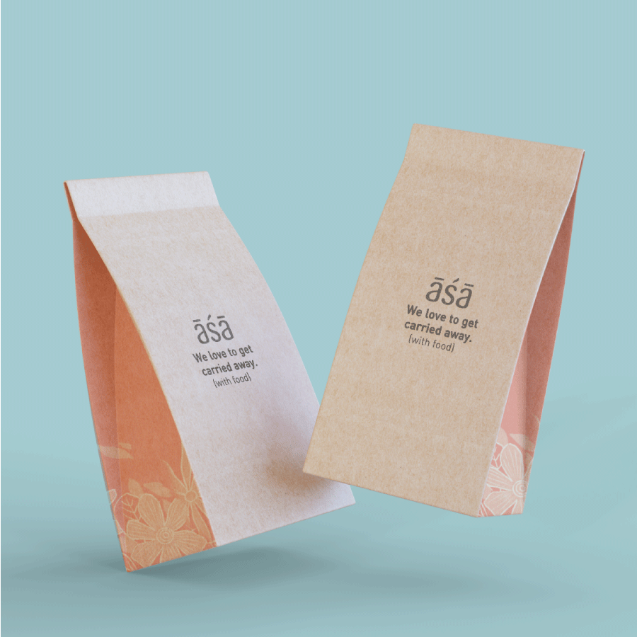
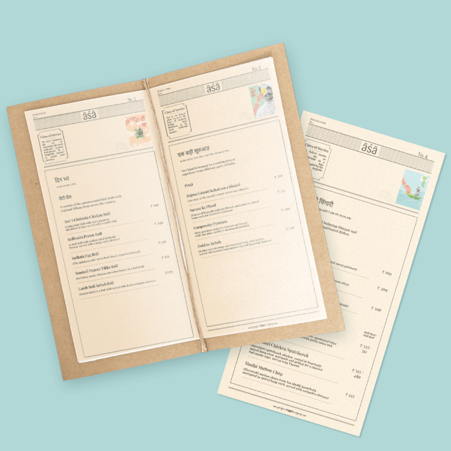
While the extended identity spoke a very vibrant, conventional, and quirky language we needed the central logo unit itself to be rather mature (in an effort to strike a balance between a serious yet light hearted brand). To put the whole story together, the artworks were then adapted for the sleeves of packaging. The entire delivery experience was enriched with excruciating minor details of converting the illustrations into stamps, sending out postcards, endearing notes, striking copy, curated Spotify playlists, using regional languages, and a telegram-like menu.
We love clients who trust us with our bold, endearing, and lesser known routes. We couldn't ask for anything better than a client like ASA!
